Modeling
Once properties have been selected and testing data defined, models can be executed to generate predictions.
The modeling tab, presented in Figure 11, offers various modeling and visualization options. First, users can select the model to use from the dropdown menu at the bottom left of the tab. The three options are Balanced Forest, Knowledge Driven and Random Forest. Users can click on Run to start the modeling process. The validation score (balanced accuracy on the validation dataset) will be displayed to the right of the model selection dropdown menu.
The validation is computed as follows:
Where:
( TP ): True Positives - the number of positive instances correctly identified by the model.
( TN ): True Negatives - the number of negative instances correctly identified by the model.
( FP ): False Positives - the number of negative instances incorrectly identified as positive by the model.
( FN ): False Negatives - the number of positive instances incorrectly identified as negative by the model.
This score is calculated based on the testing dataset defined in the Train-Test-Split tab.
A perfect classification results in a score of 1.
A random classification yields a score of 0.5.
The worst classification results in a score of 0.
The score serves as an indicator and does not necessarily reflect the model’s relevance. Specifically, a model scoring near 1 may be indicative of overfitting rather than genuinely predictive of new areas of interest.
Three visualization options are also available: Feature Importance, Confusion Matrix, and ROC Curve. Users can click on the corresponding button to display the visualization. Finally, by clicking on the Export to GA button, users can export all computed results to GA.
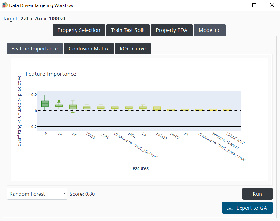
Figure 11 The ‘modeling tab’ and its different options.
Knowledge-Driven
Users can select the “Knowledge Driven” option from the dropdown menu. This option enables them to establish minimum and maximum threshold values and a weight for each selected property. It allows users to construct a model based on their geological knowledge to compare it with a data-driven approach, as show in Figure 12. the index overlay operation is computed for every point with the following formula:
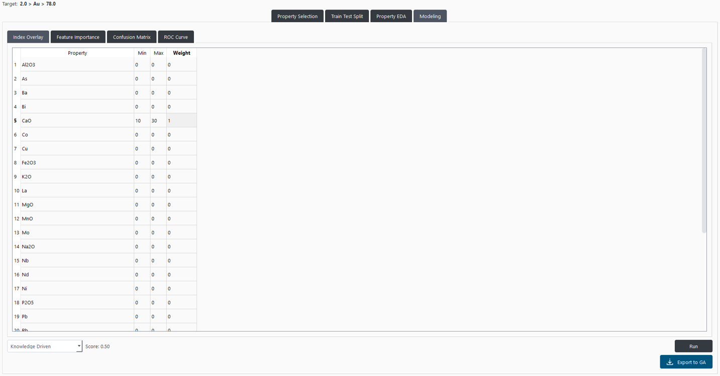
Figure 12 “Index Overlay” panel allows users to define the minimum and maximum threshold values and a weight for each selected property.
Random Forest
An option employs a Random Forest approach. This model is trained on a balanced data obtained from the Train-Test-Split panel and tested on the testing data.
Given the common issue of imbalanced positive (mineralized) and negative points, the most represented class (typically the negative) undergoes resampling. This resampling, conducted with a K-means algorithm over the selected properties, aims to ensure a representative sampling of the negative data.
The model optimization uses the grid search approach, leveraging the principle of cross-validation to identify the best parameters. Cross-validation tests various parameter combinations using different subsets of the training data. To address the issue of spatial correlation, the distinct groups defined in the Train-Test-Split tab are used sequentially in the validation phase. This strategy ensures that parameter selection is not compromised by overfitting due to spatial correlation.
The parameter combination that yields the best results is then applied to recompute the algorithm over the entire training dataset.
Balanced Forest
An option uses a Balanced Random Forest classifier from the imbalanced-learn library. This method is specifically designed to handle imbalanced datasets, where the number of positive (e.g., mineralized) and negative points is significantly unequal.
Unlike standard approaches that require manual resampling of the majority class, the Balanced Random Forest automatically under-samples each bootstrap sample to balance the classes. This means that, during training, an equal number of positive and negative samples are used to grow each decision tree, reducing the bias toward the majority class. However, as this model takes into account more data points from the majority class, it may lead to longer training times compared to traditional Random Forest methods.
The classifier maintains the ensemble learning structure of Random Forest by combining multiple decision trees, each trained on a balanced subset of the training data. Like in the Random Forest approach, parameter optimization is performed using grid search and cross-validation, relying on the spatially independent groups defined in the Train-Test-Split tab. This ensures that model tuning accounts for spatial correlation and avoids overfitting.
Interpretation Figures
The modeling process generates three figures to help users interpret the model’s performance and behavior: Feature Importance, Confusion Matrix, and ROC Curve. Those figures are available for both the Knowledge-Driven and Random Forest models.
Feature Importance
The first figure presented is the feature importance plot. This figure is generated by permutation importance. It randomly shuffles the data for one property within the testing dataset and then measures the impact on the model’s accuracy. A decrease in accuracy, associated with a positive score for the feature in the figure, indicates that the property is crucial for prediction, attributing it positive importance. If the shuffle does not affect the accuracy, it suggests the property is not utilized by the model, resulting in a score close to zero. An increase in accuracy implies the property is being used by the model, but the correlation defined in the training dataset is not present in the validation dataset, leading to a negative score. This process is repeated several times for each property to obtain a distribution of scores, which are displayed in a box plot.
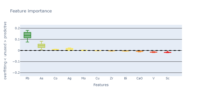
“Feature Importance” panel displays the distribution of scores for each property.
This figure offers geologists insights into which properties are impactful for the model’s predictions and which might introduce biases regarding the validation set. However, it is important to interpret these figures as indicative rather than conclusive. The relevance of a property is determined by its contribution to the model, which does not always align with its actual significance in identifying positive points in the real world. A property being classified as unused, positively important, or negatively impacting the model does not definitively dictate its overall relevance or irrelevance in identifying real-world targets. Moreover, even if a model relies on a property, removing it can lead to another solution with a better score. Conversely, removing a property with a low score can decrease the model’s performance.
Confusion Matrix
The second figure is a confusion matrix, a representation used in machine learning to visualize the performance of an algorithm. It is a table that allows the user to see the frequency of correct and incorrect predictions made by the model, classified into four categories: TP, TN, FP, and FN. This matrix provides an insightful snapshot of the model’s accuracy, helping to pinpoint where it performs well and where it may require adjustments.
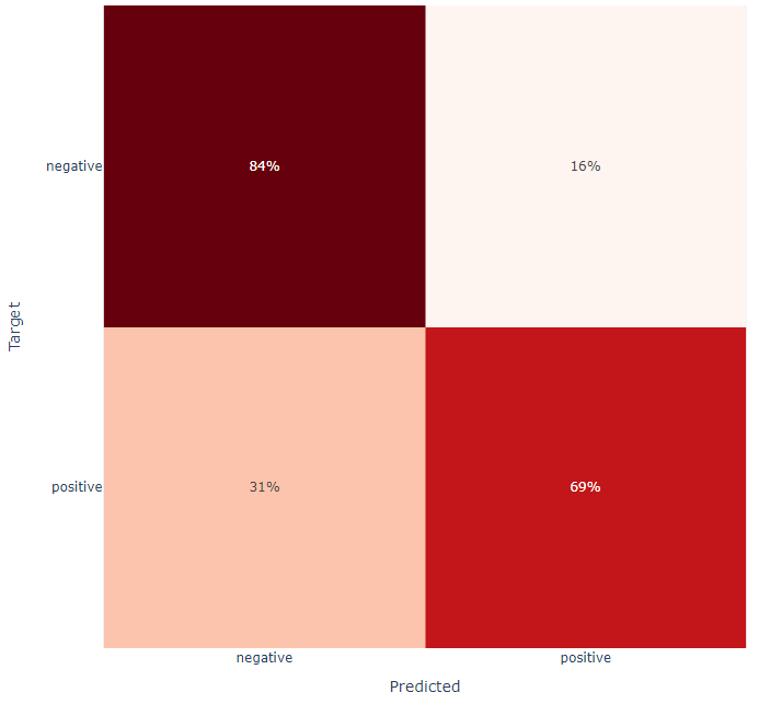
“Confusion Matrix” panel displays the frequency of correct and incorrect predictions made by the model.
The confusion matrix is specifically applied to the test data that was set aside earlier in the Train-Test-Split panel. This ensures that the matrix reflects the model’s performance on unseen data, providing a more accurate representation of its predictive capabilities in real-world scenarios. However, applying a confusion matrix to a test set that is not spatially correlated may not fully capture the model’s performance in real-world, spatially complex scenarios, potentially skewing its perceived effectiveness.
Analyzing the matrix can reveal important behavioral patterns of the model. For example, a model with more false negatives than false positives might be overly cautious, potentially missing out on identifying positive cases. Conversely, a model with more false positives might be too aggressive, leading to the identification of too many instances as positive, including those that are not.
ROC Curve
The True Positive Rate (TPR) and False Positive Rate (FPR) are used to evaluate the performance of classification models. The TPR, also known as sensitivity or recall, is defined by the formula:
where TP represents the number of true positives, and FN represents the number of false negatives. This measure indicates the proportion of actual positives correctly identified by the model. Conversely, the FPR is defined by the formula:
where FP is the number of false positives, and TN is the number of true negatives. The FPR measures the proportion of actual negatives that are incorrectly classified as positives by the model.
The output of a Random Forest model, like many classification models, is a probability ranging from 0 to 1. By setting a threshold that varies from 0 to 1 to perform the classification, one can observe the model’s behavior: at lower thresholds, the model may classify more instances as positive, potentially increasing both the number of true positives (thus increasing TPR) and the number of false positives (thus increasing FPR). As the threshold increases, the model becomes more stringent, possibly reducing both TPR and FPR. This variability highlights the trade-off between capturing as many positives as possible while minimizing the misclassification of negatives.
A ROC curve, as displayed below, is a graphical representation of the TPR (True Positive Rate) against the FPR (False Positive Rate) across different probability thresholds. The curve is generated by plotting the TPR on the y-axis and the FPR on the x-axis, with each point on the curve representing a different threshold from 0 (left) to 1 (right). In this application, the predicted testing points are also displayed on the curve to help users visualize thresholds applied to their data.
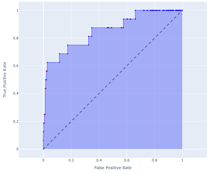
“ROC Curve” panel displays the trade-off between TPR and FPR across different thresholds.
In the context of the ROC curve, a “perfect” model would exhibit a scenario where the curve shoots straight up to the top-left corner, indicating a TPR of 1 (or 100%) and an FPR of 0 simultaneously. Such an outcome suggests that the model correctly identifies all positives without any false positives. However, this ideal scenario might also hint at overfitting.
The ROC curve visually represents the trade-off between TPR (True Positive Rate) and FPR (False Positive Rate) across different thresholds, providing users with a powerful tool to assess a model’s diagnostic ability. By examining the curve, users can identify the model’s performance across all possible thresholds, aiming to choose a threshold that balances sensitivity and specificity. The area under the ROC curve (AUC) gives an aggregate measure of performance across all possible classification thresholds. A higher AUC indicates a model with better discrimination capability, able to differentiate between the positive and negative classes effectively. This value is calculated for the user and is annotated in the top left of the ROC Curve plot.
The ROC curve is particularly useful for interpreting the model’s output, which is a probability between 0 and 1. By visualizing how prediction thresholds affect performance, users can make informed decisions on where to set the classification cut-off, based on the trade-off between true positives and false positives. Through the ROC curve, users gain insights into the model’s predictive accuracy and its potential for practical application.
Exporting Results
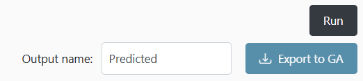
Figure 13 “Export to GA” panel allows users to export the prediction results to Geoscience ANALYST and choose its name.
For all modeling options, the Export to GA button allows users to export the current prediction results to the selected object in Geoscience ANALYST. As show in Figure 13, users can specify the name of the exported prediction in the text field before clicking the export button. The exported prediction is a continuous value between 0 and 1, representing the model’s estimated probability of each point being classified as positive. For trained algorithms, the threshold of 0.5 corresponds to the optimal cut-off identified on the training dataset. This enables users to visualize and further analyze the prediction results directly within their Geoscience ANALYST workspace, integrating model outputs into their exploration workflows.